

Using behavioural evidence to turn a long campaign page into a flexible B2B ecommerce launchpad
Flowtech's homepage had grown into a long sequence of promotional, product and corporate content. A large campaign hero dominated the first screen, while useful customer routes such as retrieving a quote appeared much further down the page.
I was asked verbally to explore a redesign. The intended next step was a Marketing content brief, but it did not materialise, so I began by establishing what the existing page was doing for customers. I analysed three months of Hotjar behaviour, reviewed industrial and B2B e-commerce patterns, benchmarked comparable and unrelated sites, audited the current page structure, and translated the evidence into a new responsive design.
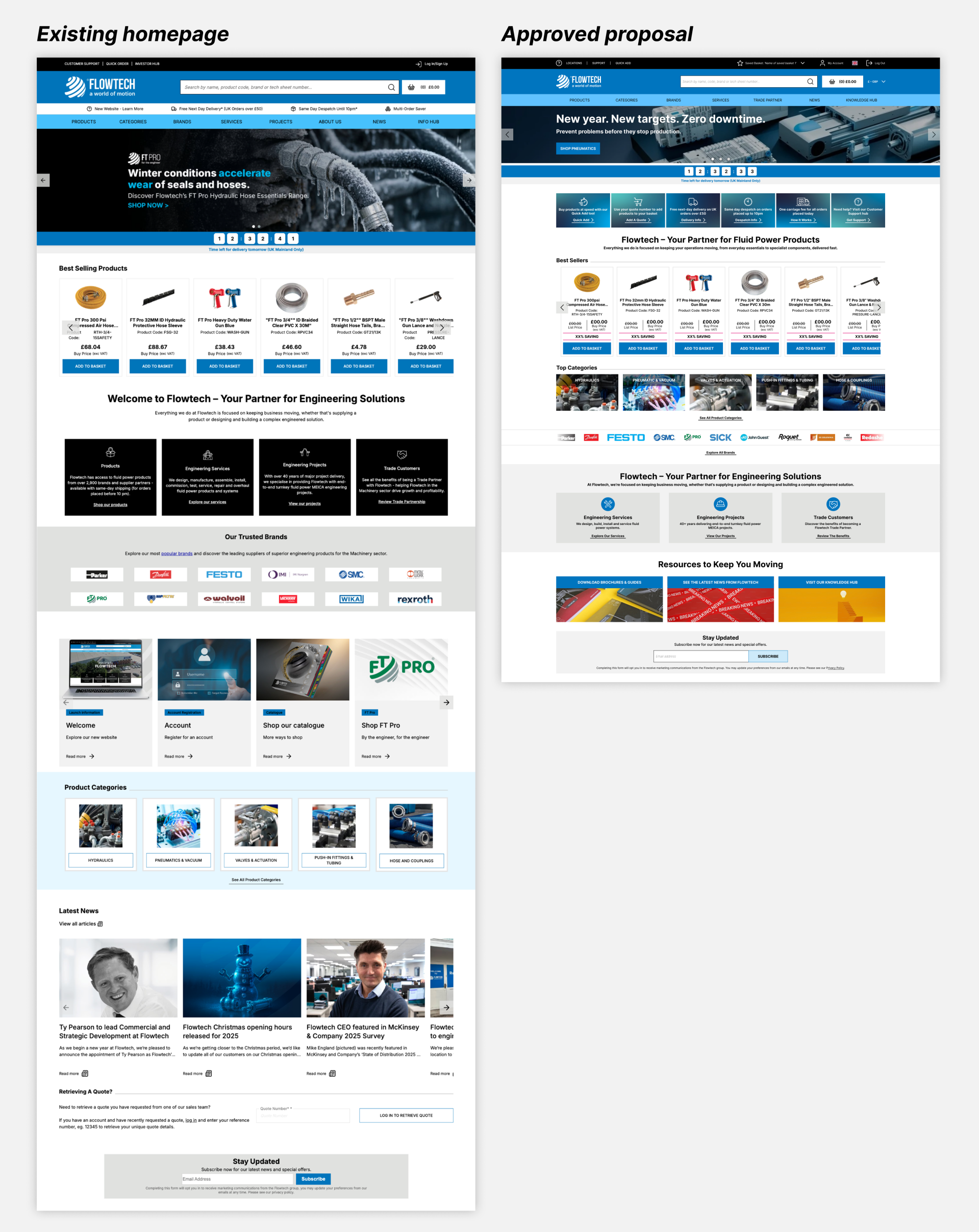
The proposal treated the homepage less like a conventional campaign landing page and more like a launchpad for high-intent tasks. It shortened the page, reduced the space taken by generic promotion, brought useful routes higher, and created modular layouts that could adapt for new visitors or customers with different product interests.
The design was approved. I produced the visual assets and created a Jira Epic with tickets for the new CMS components in July 2025. The tickets were not taken into development and are now archived, so the work remains an approved design proposal rather than a live or validated redesign.
At a glance
Role: UX Designer
Product: Flowtech B2B e-commerce homepage
Scope: behavioural analysis, desk research, benchmarking, content hierarchy, responsive UX/UI, audience variants, asset production and CMS delivery planning
Timeline: June – July 2025
My contribution: Hotjar analysis, current-state audit, best-practice research, competitor and cross-industry benchmarking, information hierarchy, responsive design, visual asset creation, stakeholder presentation, Epic creation and component-level Jira tickets
Collaboration: marketing
Status: approved and broken into CMS tickets in July 2025; not developed, tested or measured
Starting with behaviour, not a content wish list
The initial request was broad: redesign the homepage. Before deciding what the new page should contain, I used Hotjar to understand how customers were using the existing one.
Across the three-month sample, the homepage was the site's most visited page and recorded approximately 14.1k sessions. The interaction pattern was heavily task-focused:
Behavioural evidence

- 55% of recorded homepage clicks were on the search bar.
- Most other interaction was concentrated in the header, including navigation, login and the Basket.
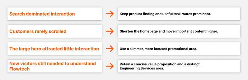
- Only 0.5% of recorded clicks were on the large hero banner.
- Scroll behaviour fell away quickly, so much of the content further down the page was rarely seen.
These figures describe recorded clicks in the Hotjar sample, not the percentage of customers who preferred a particular feature. They also do not prove that customers never value promotional or brand content. They did show that the existing page's most prominent promotional area attracted very little direct interaction, while product-finding tools dominated behaviour.
Scroll and click evidence
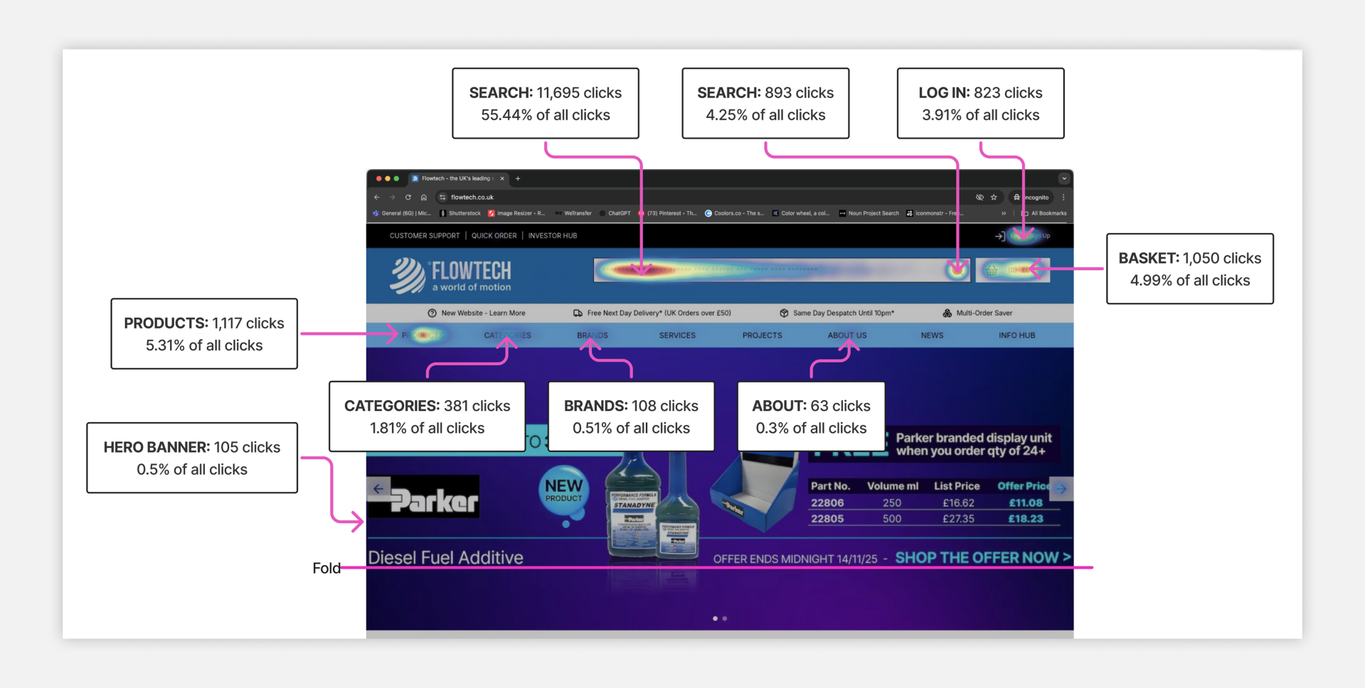
My working interpretation was that many Flowtech customers arrived with a clear product or account task. The homepage was functioning primarily as a utility layer: customers wanted to search, navigate, log in, reach their Basket or get to a familiar service quickly.
Making the missing brief visible
The behavioural evidence clarified how the page was being used, but it could not decide Flowtech's marketing priorities. I documented the decisions still needed rather than quietly making them on Marketing's behalf.

The planned Marketing brief never arrived. That became a real project constraint: I could define the structure and the jobs each component should perform, but final campaign priorities, content ownership and success measures remained unresolved.
Rather than allowing that gap to stop progress, I designed a modular system that could support different content mixes once priorities were agreed. The proposal was deliberately flexible enough to be useful as a base template, not a single hard-coded campaign page.
Learning from high-intent B2B experiences
I reviewed industrial, manufacturing and broader B2B ecommerce examples to understand how other organisations balanced speed, product discovery, trust and commercial content.
The most useful comparison was McMaster-Carr. Its experience is deliberately functional: search, categories and detailed product information help engineers get to a specific part quickly, without relying on promotional spectacle. Other B2B examples reinforced the value of clear navigation, simple categorisation, visible product and service distinctions, account-aware features, fast performance and responsive behaviour.
The research did not point to one homepage to copy. It revealed a useful tension. Existing customers may want the shortest possible route to a known product, while new visitors still need to understand what Flowtech sells, why the business is credible and which services it offers.
I turned that tension into eight design considerations:
1. Explain what Flowtech is for new visitors.
2. Keep the most important content and routes above the fold.
3. Make any promotion compact and purposeful.
4. Support product discovery with focused merchandising or category routes.
5. Give Engineering Services a visually distinct area.
6. Keep the overall page shallow.
7. Separate product, service and resource zones with clear hierarchy.
8. Prioritise clarity and performance over heavy animation.
This led to a hybrid direction: preserve space for value and commercial messages, but subordinate them to the task-led behaviour demonstrated in the Hotjar evidence.
Evidence into design decisions
Reordering the page around customer value
The current homepage contained a header and USP strip, large hero, countdown timer, best-seller carousel, value proposition, popular brands, a second promotional carousel, product categories, news, quote retrieval, marketing subscription and footer. The page was long, visually inconsistent and placed useful functions below content that attracted little interaction.
I mapped the existing running order against a shorter proposed structure.
The new hierarchy:
- Removed the separate USP strip to reduce the height of the header.
- Reduced the hero and allowed one, two or three focused messages per view instead of relying on one dominant campaign image.
- Added a task banner for high-value routes such as Quick Add, quote retrieval, delivery information, support and other utilities.
- Used the planned Crownpeak merchandising component for a more compact product carousel.
- Reduced the product-category area to five clear routes.
- Replaced the large brand block with a slimmer brand carousel and a route to the full Brand A–Z.
- Separated Engineering Services and capabilities from product merchandising.
- Added a concise value-proposition area and a small resources section.
- Kept marketing subscription before the footer without allowing it to dominate the journey.
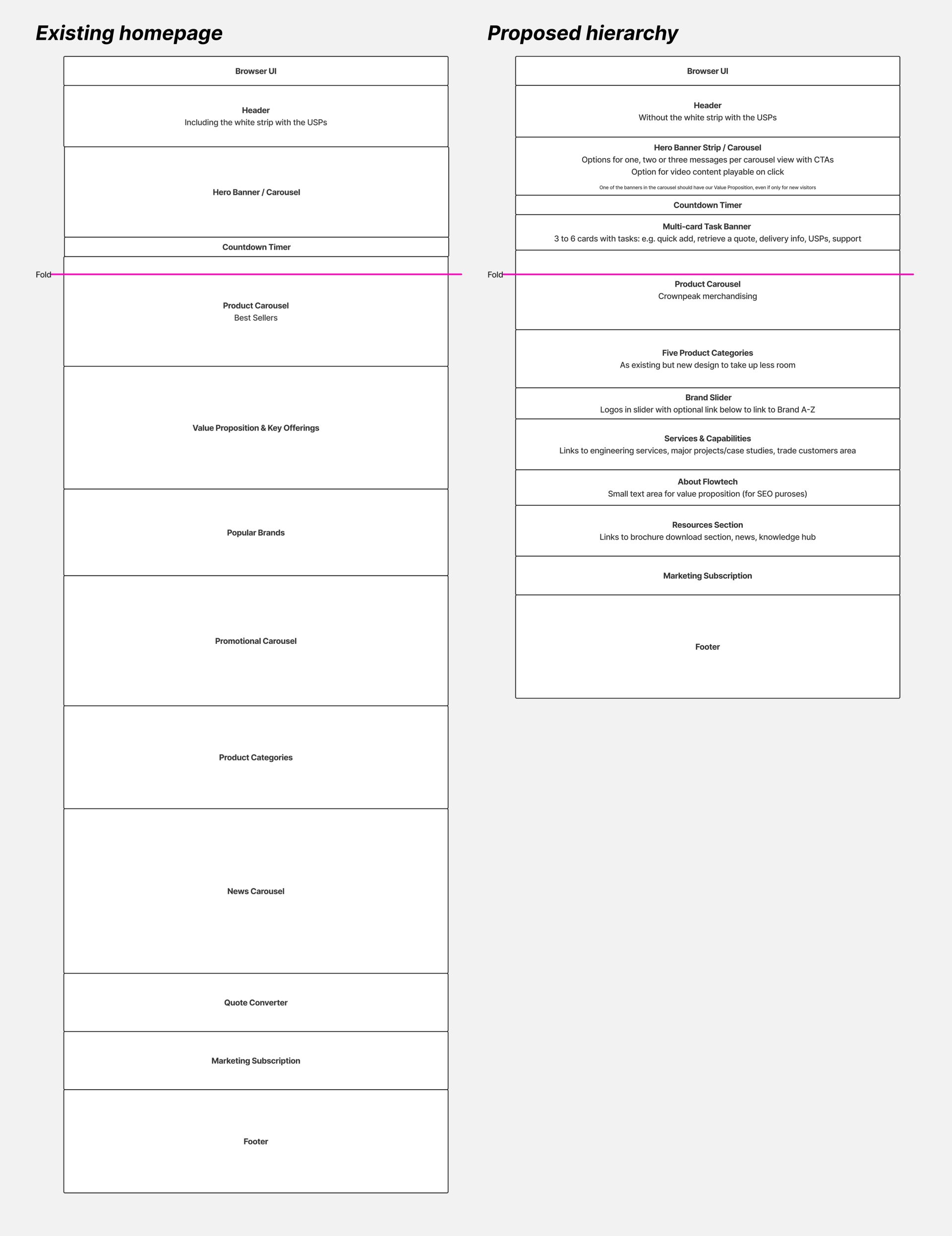
The most important change was not a new visual style. It was the running order. Useful customer tasks moved higher, the page became shorter, and every lower section had a clearer role.
Balancing task speed with promotion
The Hotjar evidence could have supported removing promotional content entirely, but that would have ignored a legitimate business need. Marketing still required a place for product offers and brand messages, and new customers still needed an introduction to Flowtech.
I therefore designed two hero approaches. The first was a shorter full-width carousel. The second was a responsive promo banner that could show multiple messages together on desktop and progressively reduce them on tablet and mobile. This made promotion more compact and allowed different propositions to coexist without occupying most of the first screen.
Responsive hero and task bar
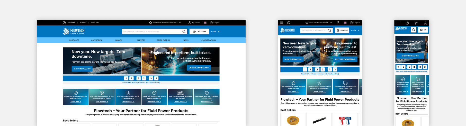
Approved design hypothesis, awaiting validation
Immediately beneath it, the new task bar made practical routes visible without asking customers to scroll. The combination allowed the homepage to support both business communication and customer utility: a small, controlled promotional layer followed by direct access to the jobs customers appeared to value most.
This was a design hypothesis. Because the page was not built, the proposal has not shown that a multi-message banner would outperform the existing carousel or that the task shortcuts would receive meaningful use.
Designing a flexible homepage system
The final proposal was not one fixed page. I created a base set of reusable homepage elements that could be mixed according to audience and content need, then demonstrated the system through responsive variants.
The base template showed the full component family across desktop, tablet and mobile. I then created:
- A new-visitor version that led with Flowtech's value proposition and balanced products with Engineering Services.
- A hydraulics-customer version that placed more emphasis on relevant products and offers.
Modular system
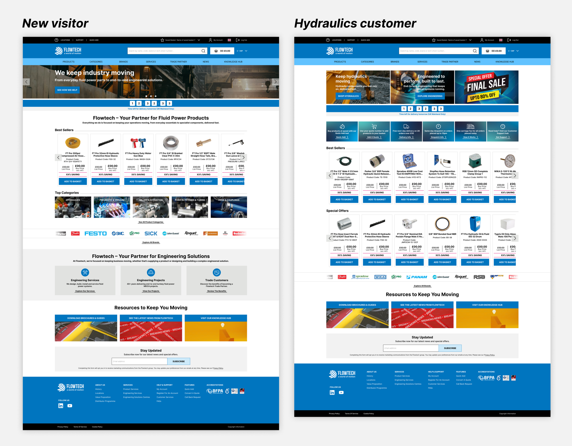
This made personalisation tangible without requiring a fully specified personalisation platform. Stakeholders could see how the same component system might support a broad newcomer, a product-focused customer or a different commercial priority while retaining a consistent hierarchy.
The new-visitor design gave the brand and service proposition enough space to answer “What is Flowtech?” The hydraulics version used the same framework to surface more relevant promotions and an additional product row. Both retained search, product discovery, task routes, brands, resources and responsive behaviour.
From approved design to delivery backlog
Once the proposal was approved, I prepared the required assets and translated the page into an Epic with separate Jira tickets for the new CMS components. That step moved the work beyond a concept board: the design had been translated into deliverable pieces that could be estimated, built and managed through the CMS. Unfortunately, the development work was never started.
The strongest delivery claim this case study can make is therefore: the proposal was approved, assets were produced, and a component-level delivery backlog was created. It cannot claim implementation, release, customer adoption or commercial impact.
What I would measure
If the project resumed, the first step would be to confirm the content owners, technical constraints and baseline metrics before refining the design further. I would then test the task-led hierarchy with representative new and returning customers and release it with measurement in place.
Primary measures would include:
- Time and number of interactions required to reach a relevant product or task.
- Use of Quick Add, quote retrieval, delivery information and support shortcuts.
- Search usage and search-to-product success as a guardrail, not simply a click count.
- Engagement with hero or promo messages by audience, position and device.
- Product, category, brand and service-route click-through, followed by downstream product views and conversion.
- Scroll reach and interaction by section.
- Behaviour of new versus returning users and any personalised audience variants.
- Page performance, especially on mobile, to ensure added CMS flexibility did not slow the task journey.
The central hypothesis would be that a shorter, task-led homepage helps customers reach useful destinations faster while preserving a smaller, more relevant space for commercial and brand communication.
What I learned
This project showed me how much value behavioural evidence can add to an otherwise subjective redesign request. The original page could have been redesigned cosmetically, but the Hotjar data changed the question from 'What should the homepage look like?' to 'What job is the homepage actually doing for customers?'
It also reinforced the difference between behavioural evidence and a content strategy. Click and scroll data could challenge the prominence of the existing hero, but it could not decide which promotions mattered, who owned the content or what the business wanted the page to achieve. Making those unanswered questions visible was part of the design work.
Finally, approval and detailed tickets do not guarantee delivery. If I revisited the project, I would bring Marketing, Product and technical stakeholders together earlier to agree the page's primary objectives, content ownership, component constraints and measurement plan before moving the full proposal into the backlog.
The work remains valuable because it demonstrates the full path from an informal request through evidence, research, information hierarchy, responsive UI, audience variants, stakeholder approval and delivery planning. Its limitation is equally important: without implementation, the proposed customer and business value remains a hypothesis.