

Improving the live experience, measuring the impact, and finding what new customers still needed
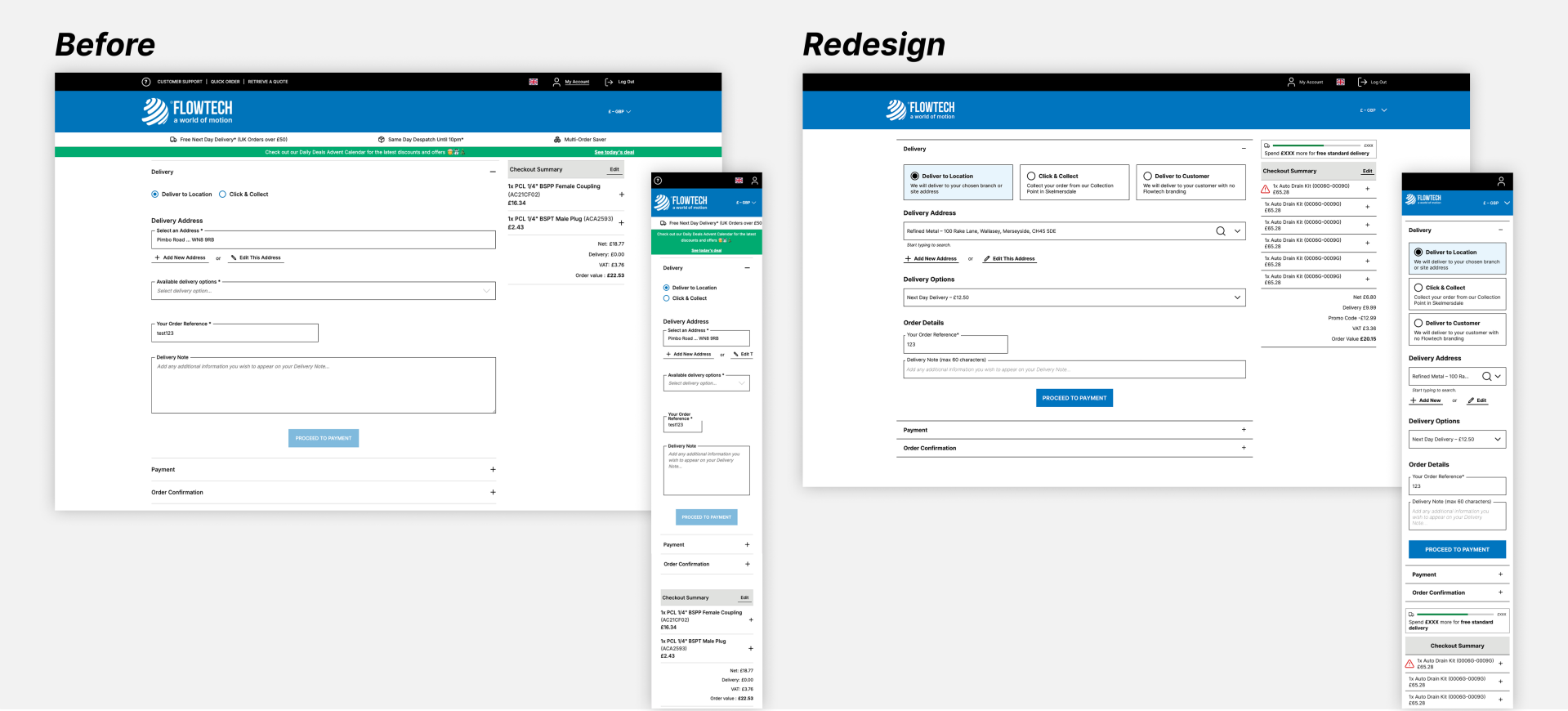
Flowtech's B2B Checkout supports several delivery methods, address requirements and service restrictions across desktop, tablet and mobile. I redesigned key parts of the Delivery and Payment journey to make those decisions clearer and reduce friction. The initial changes went live in February 2026. After an April stabilisation release, both time on the page and drop-off fell substantially in the Hotjar sample.
In July, a segmented funnel review showed that new users were still struggling far more than returning customers. I combined the behavioural data with feedback, recordings and a live-build audit to define a second iteration. Those recommendations have not yet been scheduled.
At a glance
Role: UX Designer
Product: Flowtech B2B e-commerce Checkout
Scope: Delivery and Payment across desktop, tablet and mobile
Timeline: November 2025 to July 2026, from initial research through release, measurement and the later new-user investigation
My contribution: live-experience audit, Hotjar funnel and session research, responsive wireframes, interaction and content design, ticket definition and post-release analysis
Collaboration: e-commerce and development teams
Status: Initial iteration live and measured; later new-user recommendations proposed and not yet scheduled
The problem
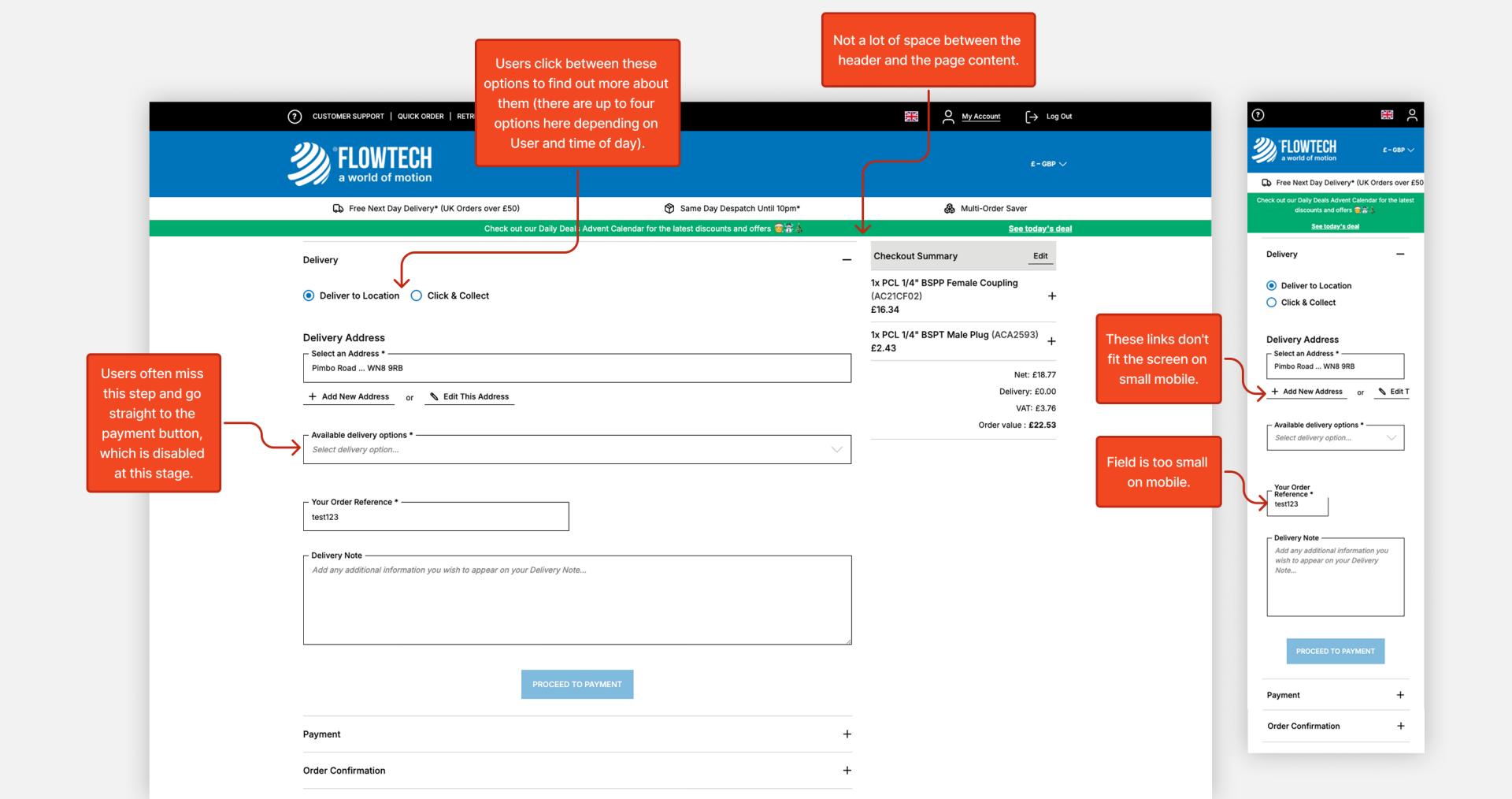
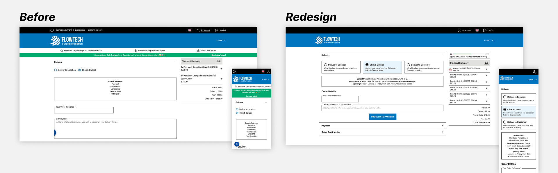
The original Checkout relied on bare delivery radio buttons, truncated addresses unnecessarily and lacked clear section headings. Mobile actions and inputs were cramped, while Click & Collect no longer showed opening hours carried over from the legacy site.
The nine improvements focused on clearer choices, better responsive usability, and more useful loading and error feedback. The address design placed lookup before manual entry, but a later audit found that both Delivery Address forms had been built differently, with a small, misplaced confirmation CTA. The Billing Address layout was correct. Delivery eligibility, pricing and service rules remained unchanged.
The original experience
Designing clearer delivery decisions
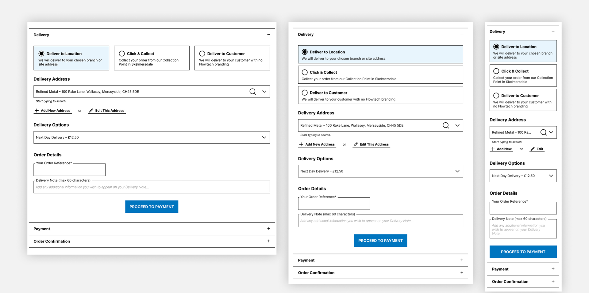
I replaced the radio buttons with responsive selectable cards that explained each delivery method before selection. I tested the pattern against a complex four-option state, including an out-of-hours service with restrictions and an additional confirmation step.
I also introduced Delivery Options and Order Details headings, removed unnecessary desktop address truncation and improved mobile spacing. The Click & Collect panel became more compact while restoring the missing collection timing and opening hours. This was a content-completeness correction rather than a measured user insight.
Responsive solution
Complex state
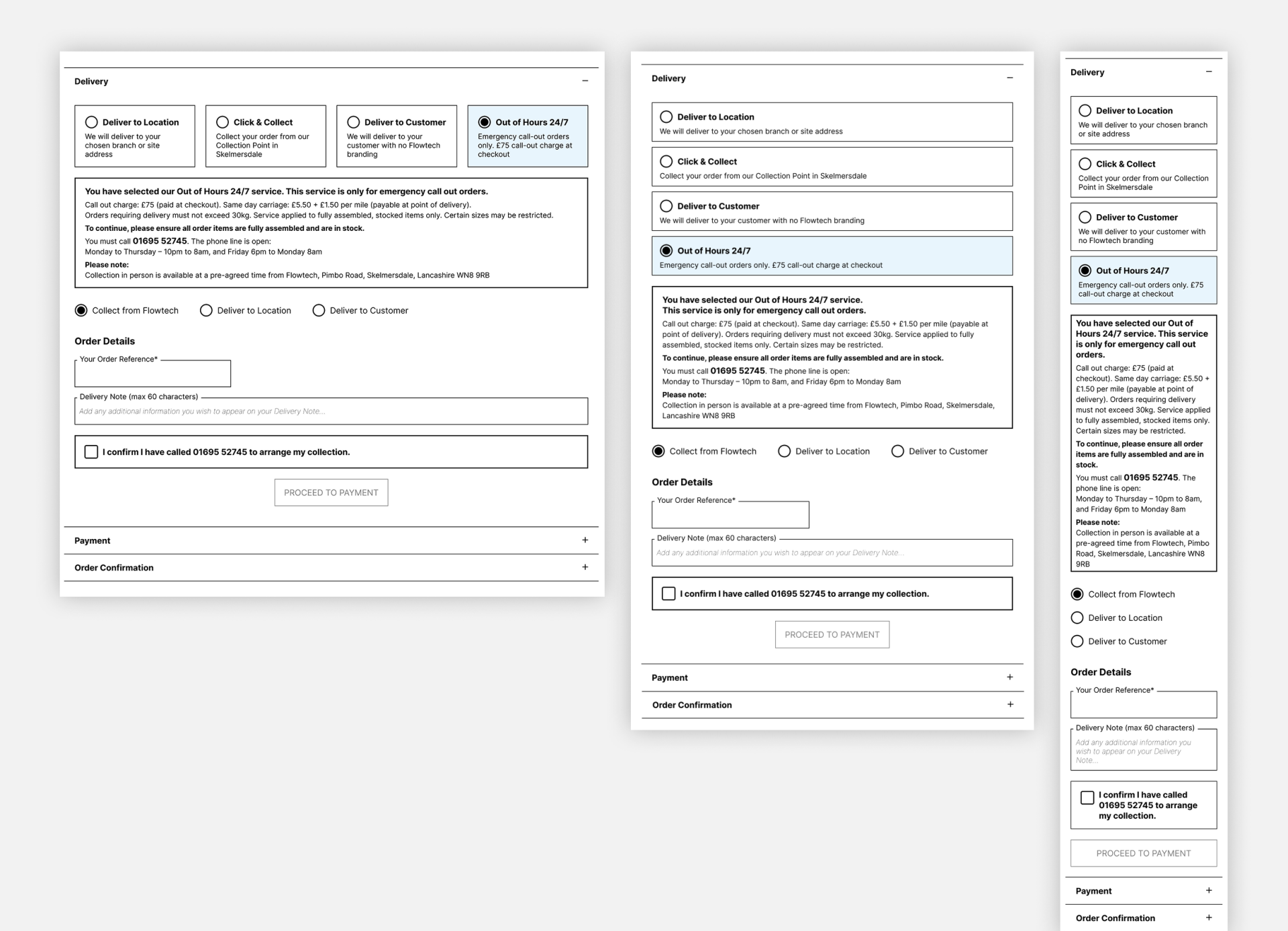
I worked with Customer Services to confirm the out-of-hours delivery details, ensuring the information and restrictions shown to customers were accurate.
Click & Collect
Designing for slow system responses
Delivery options could only load after an address was selected. During delays, the interface disappeared behind a large blue spinner, making progress feel like an error.
I designed a stable skeleton state using the existing Basket Summary pattern. The control stayed visible and, if opened, showed 'Loading delivery options…' above disabled skeleton rows. This was fully specified but deprioritised while developers addressed other Checkout issues, so it is not part of the live results.
Designed, not delivered
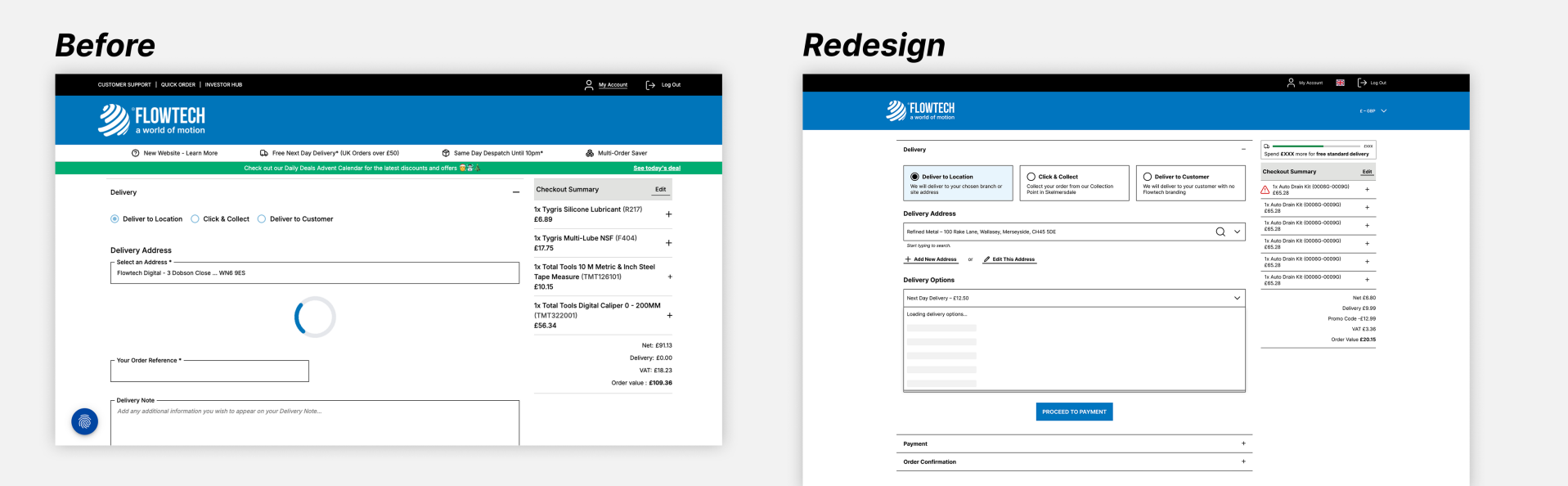
This design was a proposal but was not implemented.
Release, stabilisation and measured impact
The main UX changes went live on 24 February 2026. Hotjar performance remained broadly flat through March and early April. A further Checkout release on 23 April 2026 fixed several issues, including problems associated with the earlier Checkout changes.
The results
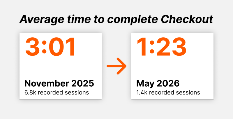
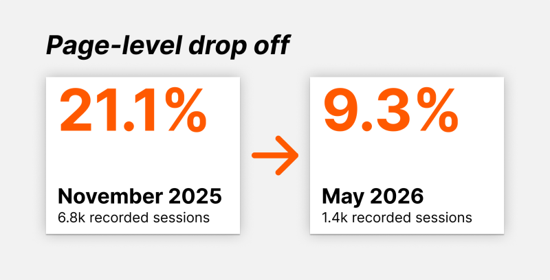
Directional Hotjar comparison; not an A/B test. Post-release click-to-payment conversion remained stable: 88.5% in 27-30 April and 87.1% in May.
The clearest improvement appeared after that stabilisation release and continued through May. The November view contained 6.8k recorded sessions and the May view 1.4k. November coincided with a temporary Hotjar upgrade, so raw volumes are not directly comparable. The rates are directional rather than proof of causation, but closely match my original internal report.
A separate click-to-payment funnel was only reliable after stabilisation: conversion was 88.5% from 27-30 April and 87.1% in May. This supports post-release stability, but missing pre-release funnel data prevents a like-for-like uplift claim.
The results also reinforced an important delivery lesson: releasing the designs was not the finish line. The measurable improvement appeared only after implementation issues had been resolved.
What segmentation revealed next
Aggregate improvement did not mean every customer was having the same experience. When I segmented the same funnel by new and returning users, the gap appeared consistently across May, June and July.
Checkout conversion by customer type
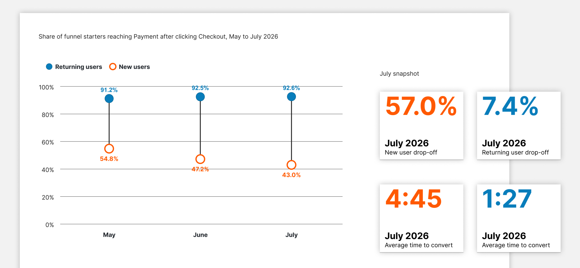
Cohort sizes – Returning Users: approx. 1.2k, 1.4k, 1.4k, New Users: 157, 125, 135
Source – Hotjar funnel: clicked Checkout → viewed Delivery → viewed Payment.
Directional sample; not an A/B test.
The stage-level data made the scope clearer. In July, 44.4% of new users dropped out between clicking Checkout and reaching Delivery, compared with 2.4% of returning users. Of those who reached Delivery, a further 22.7% of new users failed to reach Payment, compared with 5.1% of returning users. The proposed address and Order Reference changes target evidenced friction within the Delivery journey, but they cannot explain or solve the larger upstream loss on their own.
New users had no saved addresses and were unfamiliar with Flowtech's Checkout requirements. Recent feedback and session recordings showed several specific points of confusion:
- Customers did not always realise that they had to enter and confirm their delivery or billing address before continuing.
- The Use This Address CTA was small, incorrectly positioned and easy to miss in both Delivery Address journeys: adding a new address and editing an existing one.
- Disabled progression controls did not explain what was still required.
- One new customer did not understand the purpose of the mandatory Your Order Reference field or what to enter.
- The live Delivery Address form did not match the previously approved hierarchy, although the Billing Address fields were correct.
These issues do not explain the entire new-user drop-off. I treated them as the first actionable problems in a wider investigation: correct the evidenced issues, measure the effect, then investigate the remaining barriers.
The proposed new-user iteration
The next iteration restores the approved address hierarchy and adds guidance where customers need it most:
- Correct both Delivery Address forms by putting Find Address before the manual fields and restoring the approved field spacing.
- Use a consistently sized and positioned primary CTA labelled Use This Address, matching the correct pattern already used in the Billing Address journey.
- Tell customers to find or enter the address and then select the CTA to confirm it.
- Explain why Proceed to Payment or Pay is disabled when required information is missing.
- Keep Your Order Reference mandatory, but add a realistic example and persistent helper text explaining what the reference is and where it will appear.
These recommendations are not yet in a sprint. Their intended outcome is to help more new customers reach Payment without creating regressions for returning users.
Once released, I would compare overall new-user drop-off against the July baseline of 57.0% and specifically monitor the 22.7% Delivery-to-Payment drop-off that the proposed changes are most likely to influence. I would review performance by device, retain returning-user conversion as a guardrail, and continue reviewing feedback and recordings. Completed orders should be measured separately because reaching Payment does not guarantee purchase completion.
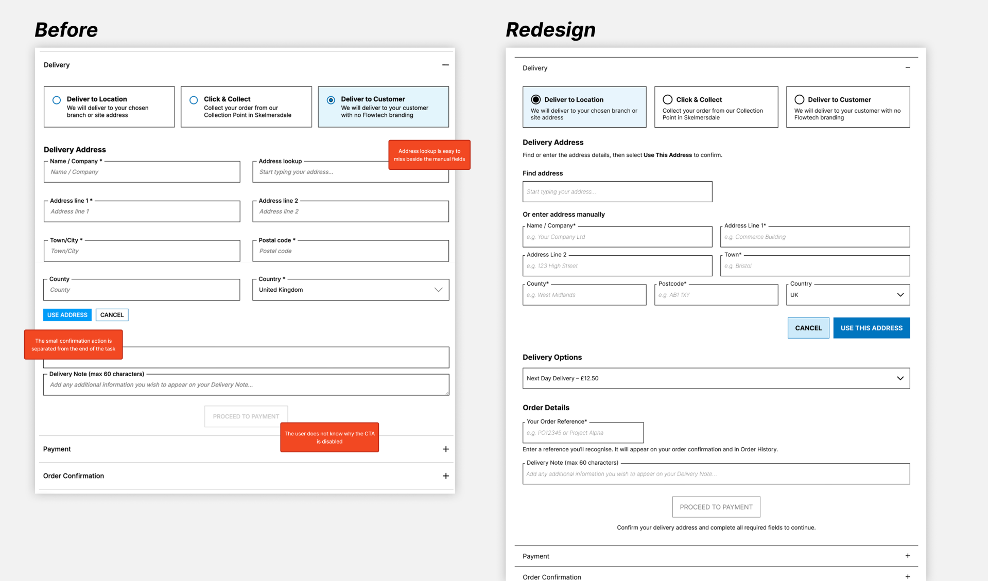
Proposed, not yet scheduled
What I learned
This work changed how I think about both measurement and design delivery.
First, an improved aggregate metric can hide a serious problem for one customer group. Segmenting the funnel revealed a new-user experience that the overall result could not explain on its own.
Second, approved wireframes are not enough if the live experience is not checked across every relevant journey and breakpoint. The difference between the correct Billing Address implementation and the two incorrect Delivery Address journeys showed the importance of systematic design QA after development.
Finally, the project reinforced the value of being precise about evidence. Some changes shipped and were measured; others were released later, remained unbuilt, or are still proposals. Keeping those states visible makes the story more credible and gives the next iteration a clear baseline to test against.